- Incorta Community
- Discussions
- Dashboards & Analytics Discussions
- Basic Statistics in Incorta (using Python if neces...
- Subscribe to RSS Feed
- Mark Topic as New
- Mark Topic as Read
- Float this Topic for Current User
- Bookmark
- Subscribe
- Mute
- Printer Friendly Page
Basic Statistics in Incorta (using Python if necessary)
- Mark as New
- Bookmark
- Subscribe
- Mute
- Subscribe to RSS Feed
- Permalink
- Report Inappropriate Content
01-03-2023 12:52 PM - edited 01-03-2023 02:00 PM
Are there much simpler examples of projects using Python then the ML Data Science in the video? For example, the software running our manufacturing machinery produces samples of production times in a database table. I would like to graph these in violin plots using Python and wondering how to go about doing this (I'm rather new to Python)...probably showing them in a daily report (changes every day).
Also, my company is on the cloud version 4.9.13 June 3rd, 2021. Is this an issue for using Python? Does the cloud version not auto update with each new version?
Some of the examples in the link below look great.
https://plotly.com/python/violin/
- Labels:
-
Data Science
- Mark as New
- Bookmark
- Subscribe
- Mute
- Subscribe to RSS Feed
- Permalink
- Report Inappropriate Content
01-05-2023 12:26 PM
Hi @olekern,
Is your goal to show a violin chart in a dashboard and have it refresh on a daily basis, or are you looking to visualize the data using python in an interactive notebook?
I'm happy to help explore both options 🙂
- Mark as New
- Bookmark
- Subscribe
- Mute
- Subscribe to RSS Feed
- Permalink
- Report Inappropriate Content
01-10-2023 01:40 PM
Hi Luke,
I'd say either/both?
First to clarify...we're actually using the on-premise version....4.9.13. I don't see any violin plot options so guessed it would need Python.
We don't have it installed currently and the data hasn't been uploaded into Incorta yet, but I think it could happen in a few days or at least a couple weeks. Attached is sample.
I'd like to maybe default to the current (or prior) date with the option to have it change with the user filtering to a different date.
- Mark as New
- Bookmark
- Subscribe
- Mute
- Subscribe to RSS Feed
- Permalink
- Report Inappropriate Content
01-12-2023 08:28 AM - edited 01-12-2023 08:29 AM
Hi @olekern,
You are correct. In your version of Incorta, there is no option for violin plot. However, current cloud versions support the Component SDK. In the future there may be a violin component created that is compatible with your version as you upgrade.
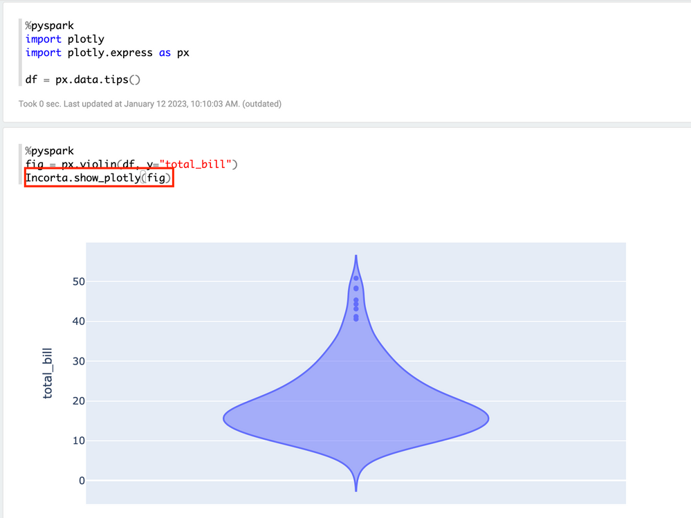
In the meantime, you have the option to use the plotly library using a pyspark notebook. The sample code from your original post is close to functional, but I had to make a couple of updates. Here is a sample code block that should work:
#import libraries
import plotly
import plotly.express as px

#get sample dataset
df = px.data.tips()

#create visualization
fig = px.violin(df, y="total_bill")

#show visualization
Incorta.show_plotly(fig)
The same result can be achieved with any dataset that has a numeric column to visualize. Please let me know if there are any other questions you have. Happy to help 🙂
Thank you @dylanwan for helping me find a solution here.
- highlight bar with MAX Value in Dashboards & Analytics Discussions
- INC_03020207 – History MV fails after adding new column to source PySpark MV in Data & Schema Discussions
- Incorta SSO Support (SAML, OAuth, OIDC) in Administrative Discussions
- Data type miss match in IF/CASE. in Dashboards & Analytics Discussions
- Pending 1:1 Demo Request – Cloud Access in Administrative Discussions

