Resolved! Challenge #6 How to Display a trend of Sales Revenue
As a Sales Analyst, I need to have a chart to determine a revenue trend over years and months, I am looking for something like this: It is straightforward, Enjoy it

As a Sales Analyst, I need to have a chart to determine a revenue trend over years and months, I am looking for something like this: It is straightforward, Enjoy it

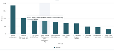
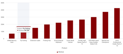
In the Sales department, I need your help getting the most sold products and the least sold products It should be in 2 insights like these: The used data files have been attached, It is very simple, When you try it you will find it is fun


Welcome to the Incorta challenge arena. This is where you can put your skills to the test. Find a problem. Solve it. Post it. Simple as that! Challenges: 1 Challenge #1 Employees transition between departments using the Sankey chart 2 Challenge #...