- Incorta Community
- Discussions
- Dashboards & Analytics Discussions
- Re: Column Chart with max bar
- Subscribe to RSS Feed
- Mark Topic as New
- Mark Topic as Read
- Float this Topic for Current User
- Bookmark
- Subscribe
- Mute
- Printer Friendly Page
Column Chart with max bar
- Mark as New
- Bookmark
- Subscribe
- Mute
- Subscribe to RSS Feed
- Permalink
- Report Inappropriate Content
05-16-2022 09:24 AM
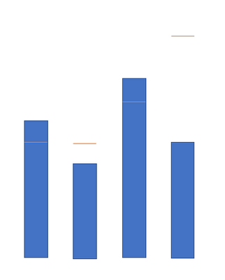
How can I build a column or bar chart showing the max line on top of each bar. for example as shown below, the bar graphs are used capacity and line are total available capacity for a storage facility.
- Mark as New
- Bookmark
- Subscribe
- Mute
- Subscribe to RSS Feed
- Permalink
- Report Inappropriate Content
05-16-2022 12:01 PM - edited 05-16-2022 12:44 PM
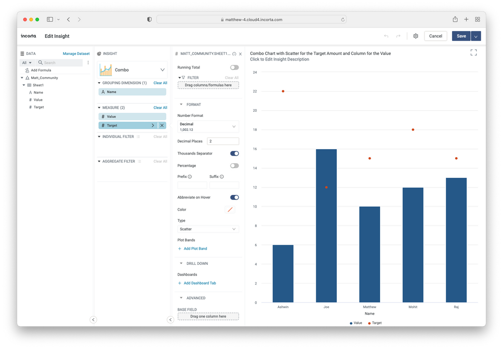
This is something that would be relatively easy to build using our Component SDK. But you can do something very similar using the combo chart with scatter as the secondary measure which will place a dot on the chart. See my example here. Hope this helps, if you have any follow up questions @mukulranjan, please let me know.
- Mark as New
- Bookmark
- Subscribe
- Mute
- Subscribe to RSS Feed
- Permalink
- Report Inappropriate Content
05-17-2022 06:48 AM
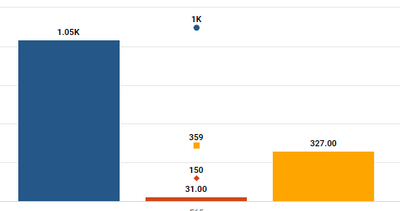
Thanks for the alternate option, this is the exact solution I have at present but it has a gap. In my current requirement I have 6 measures. 3 separate sets of value and target, linked together with colors (same color for 1 pair of value and target). but if you filter the insight with one set the column and dots do not align, dots come on top of each other instead of on top of column, as below
Is there a way I can always keep target dots on top of each column measure?
- Tracking Data lineage from Dashboard -> Business view -> Physical tables in Dashboards & Analytics Discussions
- INC_03020207 – History MV fails after adding new column to source PySpark MV in Data & Schema Discussions
- Data type miss match in IF/CASE. in Dashboards & Analytics Discussions
- Multi line column Label in Dashboards & Analytics Discussions
- Colors attached to specific result values in Dashboards & Analytics Discussions


