- Incorta Community
- Discussions
- Dashboards & Analytics Discussions
- Ideas on a More Optimal Dashboard Design?
- Subscribe to RSS Feed
- Mark Topic as New
- Mark Topic as Read
- Float this Topic for Current User
- Bookmark
- Subscribe
- Mute
- Printer Friendly Page
- Mark as New
- Bookmark
- Subscribe
- Mute
- Subscribe to RSS Feed
- Permalink
- Report Inappropriate Content
08-30-2022 04:02 PM - edited 08-30-2022 04:10 PM
I'd like to display the schema names and refresh timings in a cleaner way that takes up less space. Ideally, I'd like to put the 2 schema names and 2 timings side-by-side on one thin row. However, I haven't found a way to do this. Does anyone have ideas on how to better format these?
Solved! Go to Solution.
- Mark as New
- Bookmark
- Subscribe
- Mute
- Subscribe to RSS Feed
- Permalink
- Report Inappropriate Content
08-30-2022 04:24 PM - edited 08-30-2022 04:24 PM
@bkoenes - played around with this (2022.8) . First I built a KPI with two formulas as measures and they sat on a single line.
Also - I downloaded the Image Tile from the external component market, but removed the image in the settings to get a compacted set of text. The limitation here would be that font and formatting seems less configurable. Maybe a suggestion for the developer if you go down this route!
- Mark as New
- Bookmark
- Subscribe
- Mute
- Subscribe to RSS Feed
- Permalink
- Report Inappropriate Content
08-30-2022 05:06 PM
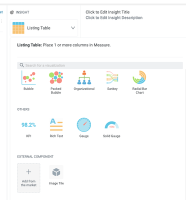
Hi Joe, that looks great! How do I access the external component market to download the Image Tile on the right? I'd love to do something similar in my dashboard.
- Mark as New
- Bookmark
- Subscribe
- Mute
- Subscribe to RSS Feed
- Permalink
- Report Inappropriate Content
08-31-2022 01:57 PM
The external component marketplace is available on Cloud 2022.6+. To access it, you'll see it as an insight-type option:
- Mark as New
- Bookmark
- Subscribe
- Mute
- Subscribe to RSS Feed
- Permalink
- Report Inappropriate Content
09-01-2022 10:32 AM
Great, thank you!


