- Incorta Community
- Knowledge
- Dashboards & Analytics Knowledgebase
- Advanced Maps
- Subscribe to RSS Feed
- Mark as New
- Mark as Read
- Bookmark
- Subscribe
- Printer Friendly Page
- Report Inappropriate Content
- Article History
- Subscribe to RSS Feed
- Mark as New
- Mark as Read
- Bookmark
- Subscribe
- Printer Friendly Page
- Report Inappropriate Content
05-27-2022 10:55 AM - edited 04-13-2023 08:23 AM
Introduction
Incorta introduced the Advanced Map Visualization, powered by Mapbox, with version 4.9. With layers, full zoom-in and zoom-out capabilities, and a selection of different map types, it can provide a rich interactive experience for your users. This article presents some ideas for how to best take advantage of what the Advanced Map visualization has to offer.
What you should know before reading this article
We recommend that you be familiar with these Incorta concepts before exploring this topic further.
Applies to
The content of this article applies to versions 4.9 and above including all cloud releases.
Let's Go
Before you dive into creating a map visualization, consider whether it is the best choice for your dashboard. Is location important to the visual story you are trying to tell? Is there a simpler visualization that communicates the information more clearly? If the answers to these questions indicate that a map will do the trick for you, then here are some practices that will help you create a better experience for your users.
Zoom and Center Behavior
Use the Zoom and Center Behavior setting to focus users in on the area of the map that is important.
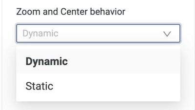
If a map is always supposed to show one geographic region regardless of who is looking at it or how the data is filtered, then you will want to choose the Static setting for Zoom and Center Behavior. Be sure to click on the Zoom and Center link below the field so that you can focus the default view on the part of the map that is important.
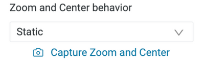
Dynamic maps can add some excitement to your dashboards because they “move”. Use the Dynamic setting when different users will see different data on different parts of the map or if data is being filtered and you want the map to change to reflect only the data that remains after filtering.
| Recommendation | Notes |
| Use the Static option for Zoom and Center Behavior if all users should see the same part of the global map. | From the Analyzer you can zoom into exactly the part of the map that is important and lock in that portion so your users see exactly what you want them to see. |
| Use the Dynamic option for Zoom and Center Behavior users should see different parts of the map based on their privileges or how they filter. | The Dynamic option will zoom the map in or out based on the data elements that display on the map. |
Layers
Creating multiple layers on your map allows you to show different data at different geographic levels (country, state/province, lat/long etc…). Use layers to make your maps interactive so that when users zoom in or out, they can get to different information that is relevant to their current zoom level.
Each layer you define can be made visible regardless of how far in or out your user has zoomed or it can be made visible over only a portion of the zoom spectrum. Pay attention to where layers “overlap” when zooming as that behavior either enhances or detracts from the user experience. Here are some recommendations to keep in mind.
| Recommendation | Notes |
| Align the zoom level of the layer to what the user is able to see. | For example, if your user is zooming in far enough to see individual buildings, it would not be appropriate to start the display of a layer that provides information aggregated at the country level. |
| As you transition from one layer to the next, do not leave zoom level gaps. | If there are zoom level gaps, then as the user zooms in, at some point the map will be empty before the next layer begins to display which could cause confusion. |
| If you choose to display more than one layer at the same zoom level, put the more granular level layer on top of the less granular level. As a general rule, order your levels and your zoom levels from largest geographic element (e.g. country) to smallest (e.g. lat/long) | If the less granular level is on top, then the user will not be able to hover over the more granular level to get information. |
| If you choose to display more than one layer at the same zoom level, make sure that the layers have some transparency so that one does not hide the other. | If, for example, you choose to show both zip code/postal code and county layers at the same time then you would want the layers to be transparent enough not obscure the other layer type. |
Labels and Tooltips
By default, data elements on Advanced maps are labeled with their values. For example if you have a layer at the State level, the State Name can be displayed as a label whenever that layer is visible. This is pretty useful for the satellite map type but for other map types that display state names as part of the map itself, the information is duplicative. If you are mapping points based on latitude and longitude, the labels can be quite distracting. One way to keep your maps cleaner is to hide labels where they are a distraction.
With Lat/Long Labels
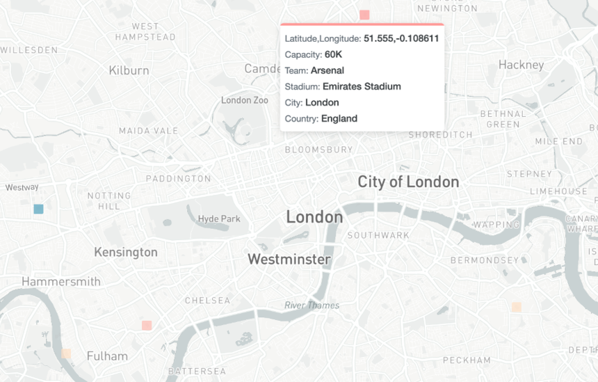
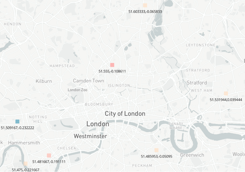 If you choose to hide labels, users can still see the label information when they hover on the data area/point. By using the Tooltip feature, you can enhance the hover to also provide other useful information.
Without lat/long labels, with tooltips
| Recommendation | Notes |
| Hide labels if they distract from the display | You can produce a cleaner map that is easier to read when you hide labels. |
| Use Tooltips to provide supporting information to the data elements you display. | By hovering on a data element, users can see both the label values and any Tooltips that have been defined for the data element. |
Max Rows
If you are wondering where your data points are and your map looks like this:
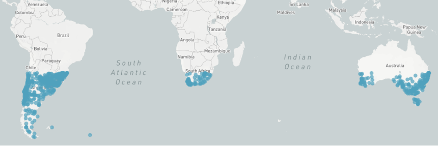
Check your max groups setting. The default is 1,000 and your expected data set is probably greater than that. Because Mapbox tends to populate the map from bottom to top, you may see a pattern that looks like the one above. Check the maximum number of data points your map will display and make sure that you set the Max Rows setting to a number greater than the sum of all of the data points across all of the layers you are using. Note that you may get a warning when you set the Max Rows value above 10,000. It will accept higher numbers. Once you have done this, you should see all of the data points that you expect.
| Recommendation | Notes |
| Set Max Groups to a high enough number such that all data points can display. | You must sum all of the data points across all of the layers in your map. For example, if your map contains a country layer filtered to the United States of America (1 country), a state layer (50 states) and a county layer (3,243 counties [2021]), you would need to set the Max Groups value to be equal or greater than 3,294 in order to display all of the data on the map. |
Performance
The more data that is pulled into an Advanced Map visualization, the longer it will take the map to render. If you are reporting on hundreds of thousands of data points in a dashboard, you will likely see your other charts and tables of data render first even if they represent the same data you are pulling into a map. Incorta is exchanging data back and forth with Mapbox in the Advanced Map visualization which provides wonderful rich maps but can add wait time as the amount of data rises.
If you are looking to improve the performance of a dashboard with an Advanced Map visualization, the first thing to do is review the best practices of Dashboard Design for Performance. The second thing to do is to understand that every data point that can display on every layer in an Advanced Map will be returned when the initial request is made. This is regardless of whether the data will display by default in the map. This means that if your map is only showing bubbles at the country level to start but has other hidden layers below it (e.g. state, city, lat/long), the map will get all of the data before displaying the 200+ data points that you will see before zooming.
So how do you improve performance when you want your maps to be able to provide lots of information. Here are some recommendations.
| Recommendation | Notes |
| Use a Runtime Security Filter to limit the amount of data based on the user who is logged in. | This is a good way to limit the number of data points based on the viewer’s privileges. A common use case for this is to apply a Security Filter that limits a salesperson’s view of a map to only his/her territory. Use the Dynamic Zoom and Center option in the insight if you would like the user to see just their area of interest. |
| Break up a large map into multiple smaller maps that together show the full geography desired. Display the maps side by side so that the viewer can still see all of the data. | By breaking up a map into multiple maps, each request will have fewer data points. Incorta/Mapbox can efficiently work in parallel on the requests to bring them back sooner. |
| Provide a map that presents data at an aggregated level only and provide a drill down on the aggregated level to another map that contains the detail. | When dashboard users drill down, the results on the destination dashboard will automatically be filtered. Use the Dynamic Zoom and Center option in the destination map insight to focus the map on the filtered area. |
| Consider using Bubble Clustering in your layer settings. This feature was introduced in 2021.4.1. | This visualization shows dynamic aggregations that change as you zoom. Because you only need one layer to show your data, you save on the number of data points that you use. |
Note: Up to about 300,000 data points will render fairly fast. As you get beyond that, wait time will be noticeably slower.
