- Incorta Community
- Knowledge
- Dashboards & Analytics Knowledgebase
- Dashboard Design Principles
- Subscribe to RSS Feed
- Mark as New
- Mark as Read
- Bookmark
- Subscribe
- Printer Friendly Page
- Report Inappropriate Content
- Article History
- Subscribe to RSS Feed
- Mark as New
- Mark as Read
- Bookmark
- Subscribe
- Printer Friendly Page
- Report Inappropriate Content
on
03-14-2022
03:18 PM
- edited on
03-07-2023
03:49 PM
by
![]() Tristan
Tristan
Introduction
This article looks at the advantages of Visual Analytics and discusses best practices when looking at data in Incorta.
What you should know before reading this article
We recommend that you be familiar with these Incorta concepts before exploring this topic further.
Applies to
These concepts apply to version 4.6 and above of Incorta for customers implementing Incorta on premises or in their own cloud and versions 21.3.1 and above for those using the Incorta Cloud.
Let's Go
What is Visual Analytics?
Visual analytics is a set of techniques that enables the presentation of data in a visual form to make its meaning easier to understand. Today, more than ever, visually representing information is critical to supporting the speed at which decisions need to be made given the amount of data we deal with daily. Key information needs to be presented in an intelligible and actionable manner in order to help in making decisions.
Why data visualization?
A more efficient way to present data
Interpreting or researching data displayed in a table can be discouraging given the amount of time it can take. Introducing visual elements to the data saves considerable time. Using visualization techniques to access key data makes your analysis faster, easier and more accurate.
For example, if you display numbers in a table using standard formatting, it can be difficult to understand what a table represents. However, by distinguishing the numbers with the use of visual cues, it becomes easier to understand the raw data better.
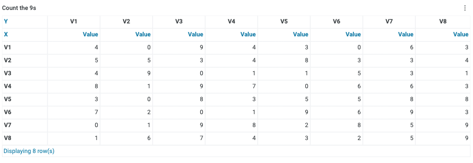
Here is an example. Looking at the table below, how many 9s can you count?
That should have taken some time. The right answer is 8!!
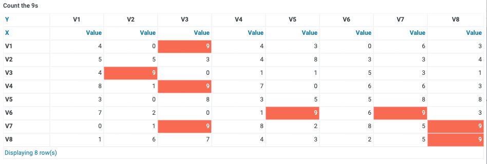
What about answering the same question now?
Adding one visual element (color coding the 9s) has made a tedious task a lot easier, and will improve your efficiency as the amount of data in the table grows.
More advanced visualization techniques provide the opportunity to present heterogeneous data on a single screen and thereby facilitate analysis further.
A better understanding of data
Data visualizations help make complex data more understandable and lead businesses to ask better questions and make better decisions. Presenting data in a tabular format and looking at statistical information can help, but visualizing the data in other ways can give an additional layer of understanding that completes the analysis.
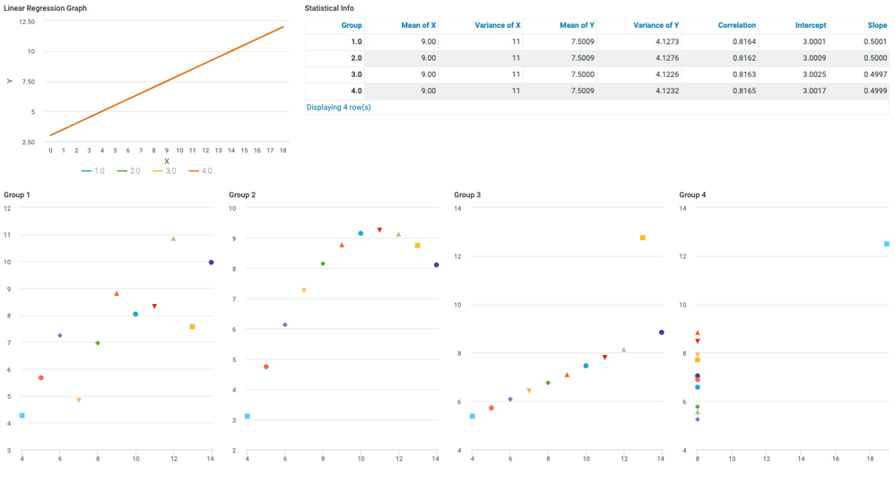
Anscombe's quartet is a clear example that illustrates this phenomenon.
The data we are looking at relates to 4 data series, for which we have tracked X and Y variables.
When performing a statistical analysis on the 4 series data sets, you will notice that they have virtually the same properties. The mean, the variance, the correlations and the regression line are all similar in value or identical. This could lead you to believe, based on this information alone, that all 4 series are identical.
Let's say that each series is a sales region, our X and Y represent Sales and Cost, and each point represents an individual store. At a summary level, as noted, the data looks the same for all 4 series. The difference are effectively hidden.
If, however, we visualize these 4 series in a graphical way, we spot clear differences right away.
Seeing the data graphically allows you to see outliers within the data which adds complementary information to its statistical properties. Additionally, seeing the data this way affords an opportunity to take action. In this example, you could look more closely at the outlier in series 4 and understand with more granularity how the performance is different from the other points in the series. This analysis may lead you to take actions that can improve overall performance of your business.
Easy data manipulation and analysis
Data Visualization techniques allow you to present heterogeneous data, scattered through multiple data sources and formats on a single screen and thereby facilitates analysis and decision making. Insights can be communicated between different teams in an easier manner, and users can react in real time to information and drill down to the level of granularity that is relevant to their function.
Creating Great visualizations
A great visualization is one that is useful to its audience, and therefore a visualization needs to adapt to the group it targets. For example, looking at data at its most granular level may be interesting to some users, like analysts who need to steep themselves in the detail, but may not be the information an executive would be looking for; they may be more interested in global summarizations and aggregated KPIs.
A great visualization is the result of the combination of data analytics, design and communication. It should offer a snapshot of complex data that points out its significance in an intuitive manner. As per Edward Tufte, professor of Computer Science and Statistics at Yale University, “Graphical Excellence consists of complex ideas communicated with clarity, precision, and efficiency”.
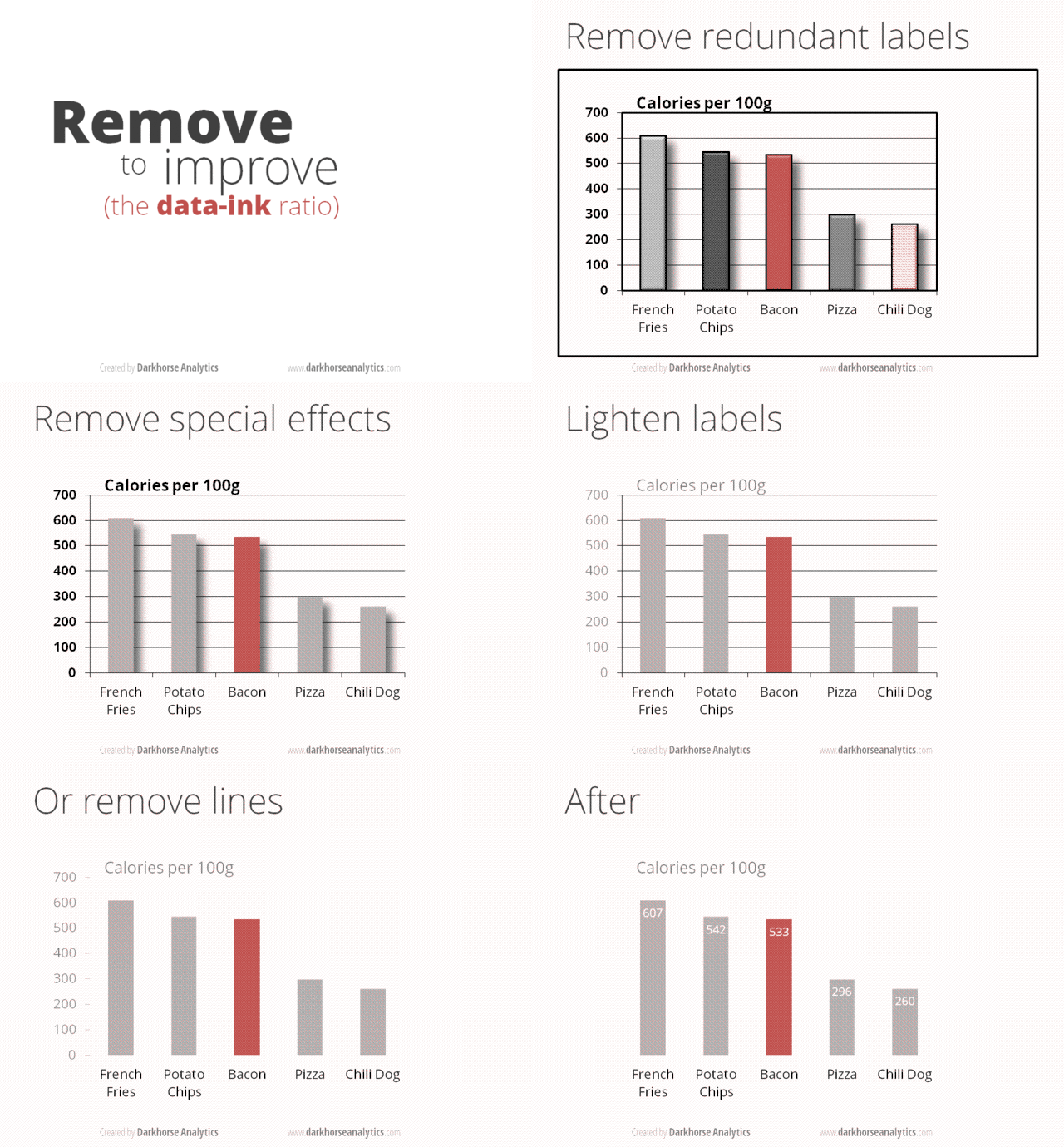
Regardless of the type of graph you choose, your main focus as a content creator is to make your visual analysis simple and to provide the information that the audience needs in a clear manner. As seen in the example below, a lot of clutter can be removed as the main information can easily be understood from a simpler version of the same graph.
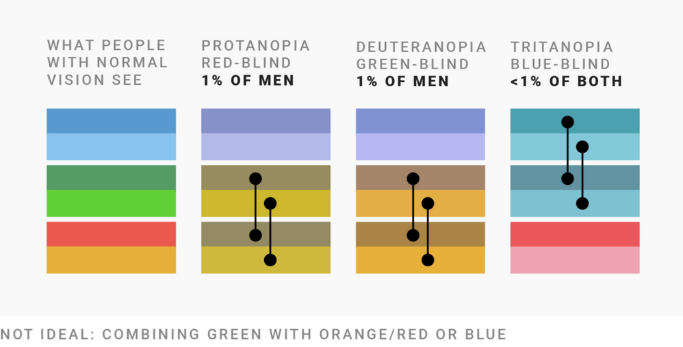
The visualization creator should cater to the audience and be mindful of how all users will the visual. This includes designing for those who are color blind. Many users who are color blind will not be able to identify different elements in a dashboard and understand a graph based on color alone.
Simple changes to visualization design can broaden the audience that finds a certain visual useful and can expand its audience. The safest choice is to refrain from using green when combining it with other colors, and instead to choose blue with either orange or red. Mixing different lightness levels for each selected color also helps to differentiate between them.
But for simplification, try to use as few colors as possible. The more colors you use, the harder it will be to differentiate for all users, and even more so for color blind users. Choosing a chart type that relies less on color is sometimes a better idea.
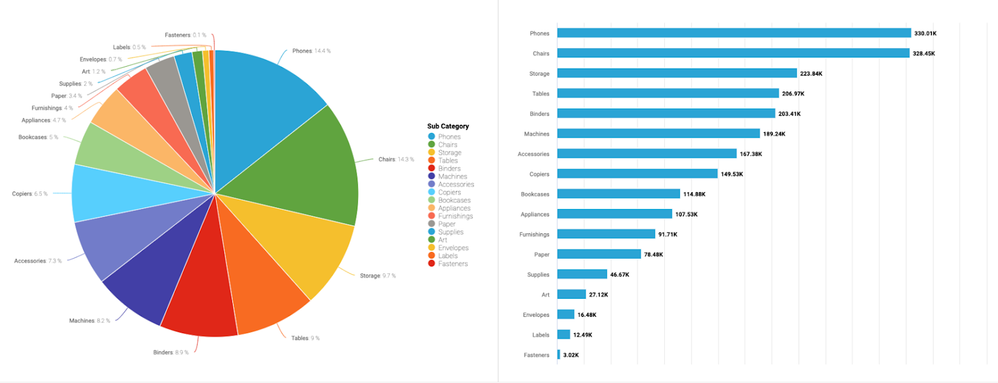
Looking at the example below of sales by subcategory, your first reflex when it comes to seeing the performance of all products might be to build a pie chart. If you chose that visualization, however, you end up with so many colors that it is difficult for regular users to identify specific subcategories and make it nearly impossible for color blind users to use the chart. A simple bar graph gives a better result, representing the same information better and clearer.
Building dashboards combining multiple insights is a key element of data visualization. Making the important information available to users within a single screen allows them to quickly compare and answer their initial questions and leads them to drill down for further information.
Understanding your data will lead you to better grasp the story you want to tell your audience. Knowing that audience and understanding what is critical to them is key in shaping the story you will convey with your visualization. This story could be the result of trends, correlations, outliers or other elements you have explored within your data. From those explorations, ensure that you select only what is relevant to your audience and falls within their context and function. You should not add unnecessary insights that could distract users from the main message; this is just noise.
Once you have identified the key relationships within your data, you can start considering the best techniques for communicating your message. Select the combination of charts and tables that lead to your findings and highlight the data points that illustrate the result; our article on Visual Analytics in Incorta gives more information on what different types of charts are great at representing. Adding a text summary or description and well labeled titles help to point out the message.
Once a dashboard is created, it is easy to share it with your colleagues or a broader audience. From there, users will be able to draw their own conclusions from the data by interacting with your dashboard.
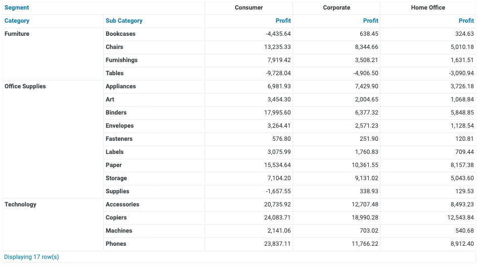
Looking at the following example of a fictional store, you may be tempted to build a table summarizing the sales performance for the company across their product portfolio. This is an insightful piece of information but does not lead to taking a business action by itself.
Reading through the table is not intuitive, understanding which combination of product and segment is not performing well is not easy. You may be tempted to introduce a color element, or look at it as a single chart but even that would only help you easily answer one single question. Further questions would require moving to other tables and other pages.
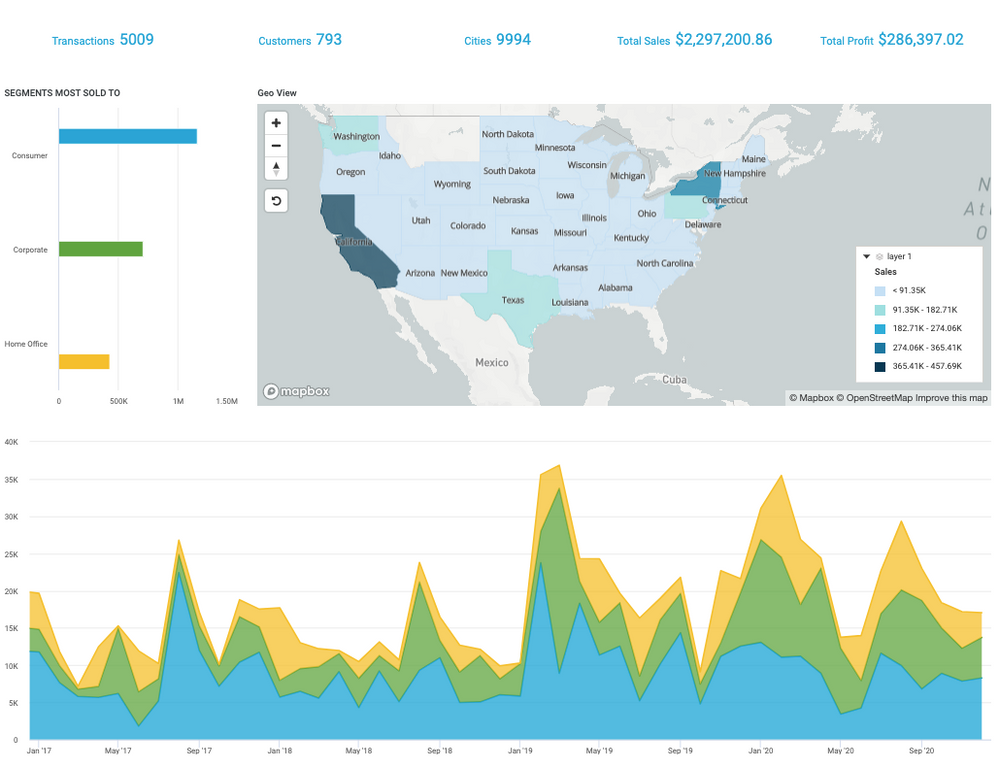
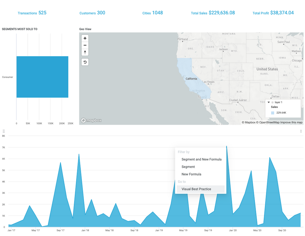
By representing the information in a dashboard, you start to get a better picture of the data. A General Manager needing overview information can quickly absorb it and understand what the company's performance is like across all its segments and markets.
Segment managers can easily drill down to their own segment of focus and look at the best performing regions in couple of clicks. This can quickly understand how their regions are performing and can drill down even further for a more granular understanding. Visual analytics techniques guide an end user in their analysis, and lead them to answer more and more questions as they interact with the dashboard. Some questions do not need to be answered on the main dashboard, but the user could be pointed to that more granular view as they answer their initial question.
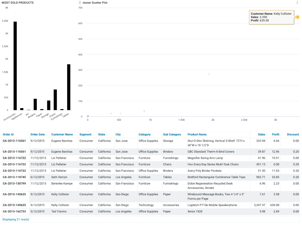
One dashboard, via drill through, can lead to another with more granular data while at the same time filtering it. Instead of looking at a table with million transactions, you will see only the transactions that are of interest to you. In this case, you know which products you sold the most of based on the interaction in the previous dashboard and can make more accurate business decisions.
Summary
Visual analytics provide a set of tools and techniques that allow you to open up your hard earned findings to a broader audience and allow that audience to analyze the same data in their own way and for their own purposes. Incorta enables the analytical journey for all users offering a broad range of graphs and dashboarding capabilities. Coupled with a data repository that becomes your single source of the truth and Incorta's Direct Data Mapping, which delivers analytical insights at amazing speed, Incorta helps you simplify the process of answering complex questions.
