- Subscribe to RSS Feed
- Mark as New
- Mark as Read
- Bookmark
- Subscribe
- Printer Friendly Page
- Report Inappropriate Content
- Article History
- Subscribe to RSS Feed
- Mark as New
- Mark as Read
- Bookmark
- Subscribe
- Printer Friendly Page
- Report Inappropriate Content
on
08-25-2023
12:45 PM
- edited on
08-25-2023
01:13 PM
by
![]() Tristan
Tristan
Introduction
The visual table is a new SDK component available from Incorta Marketplace. It is a tabular view of your data with the ability to add images. The allowed image types are jpg, png, JPG, and PNG.
With multiple dimensions and measures, the visual table offers the dashboard developer the ability to create an insight that presents all details together with a descriptive image for each row:
- An image column or any other type as a grouping dimension
- One or more measures
The visual table allows the option to sort the table based on a specific column, drill-down into a dimension as supported in the aggregated table, variant cell padding, and an option to lock the aspect ratio of the added images.
How to add your images
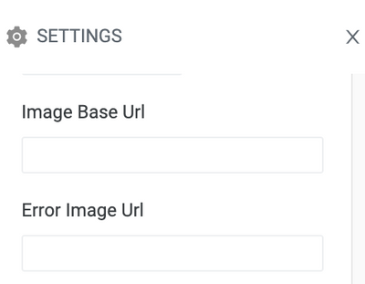
You just need your data set to include a column containing your images' links. Or, you can add the Image Base URL in Settings and make sure your data set column contains the actual image names. At runtime, the base URL and the image name will be concatenated to retrieve and present your unique target image. In addition, you can add an Error Image URL that will appear in case an image fails to get retrieved or if an image is missing in your data set.

Additional image settings
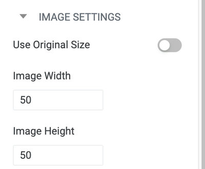
The visual table allows several image settings. You can change the image width and height or ignore the added values for the Image Width and Height and use the original image size only by enabling the “Use Original Size” toggle. You can lock the aspect ratio of your images by enabling the toggle, however this option is only available with version 2023.4.1 and above.

Are there table settings that help with the overall look of the visual table?
Yes, you can add your preferred cell padding.
- In the analyzer, go to settings
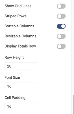
- In the table settings section, write the “Cell Padding” value that you would like to use. The default is 16.
In addition, you can always assign your preferred “Row Height” value and much more.

Are sorting and the drill-down options available with visual tables?
Yes, to allow the sorting option:
- In the analyzer, go to settings
- In the table settings section, enable “Sortable Columns” toggle.
To drill-down into a dimension:
- After creating the visual table insight and saving it, you can use the drill-down option at the dashboard level. Click any value in a dimension column to filter the visual table as well as the whole dashboard based on this value. You can use the image itself as the filtering dimension as well.
Visual Table Settings
| Name | Description | Control |
| Auto Refresh | Enable automatic refresh of the table contents upon any change. | toggle |
| Apply Runtime Filters | Enable inheriting filter settings from the dashboard settings. | toggle |
| Use Image Original Size | Display images in their original size. | toggle |
| Image Width | Specify the width of the image displayed in the table. | text box |
| Image Height | Specify the height of the image displayed in the table. | text box |
| Image Url | Specify the base Url for the image displayed in the table. | text box |
| Error Image Url | Specify the base Url of the placeholder image displayed when an image fails to load. | text box |
| Image Types | Specify the file types allowed for the images displayed in the table. | text box |
| Rows Per Page | Specify the maximum number of rows displayed on a single page of the table. | text box |
| Show Grid Lines | Display grid lines in the table that acts as delimiters. | toggle |
| Striped Rows | Alternate row background color for easier readability. | toggle |
| Sortable Columns | Enable sorting the columns of the table when you click the column header. | toggle |
| Resizable Columns | Enable resizing the columns of the table using the mouse. | toggle |
| Display Total Rows | Displays the sum of each measure column at the bottom of the table | toggle |
| Row Height | Specify the height of each row in the table. | text box |
| Font Size | Specify the font size of the text displayed in the table. | text box |
| Cell Padding | Specify the amount of padding between the cell content and the cell border. | text box |

