This website uses Cookies. Click Accept to agree to our website's cookie use as described in our Privacy Policy. Click Preferences to customize your cookie settings.
Turn on suggestions
Auto-suggest helps you quickly narrow down your search results by suggesting possible matches as you type.
Showing results for
- Incorta Community
- Knowledge
- Dashboards & Analytics Knowledgebase
- Guide to Building with the Incorta Component SDK
Options
- Subscribe to RSS Feed
- Mark as New
- Mark as Read
- Bookmark
- Subscribe
- Printer Friendly Page
- Report Inappropriate Content
Employee
Options
- Article History
- Subscribe to RSS Feed
- Mark as New
- Mark as Read
- Bookmark
- Subscribe
- Printer Friendly Page
- Report Inappropriate Content
09-04-2024 04:43 PM - edited 09-05-2024 08:18 AM
Introduction
The Incorta Component SDK is a powerful tool that allows you to build your own custom visualizations to use in Incorta dashboards. This article provides step by step instructions for how build your new components.
Steps to Create a Component
- Download and install the SDK
- Create a New Component
- Run the command:
create-incorta-component new - Follow the prompts to
- Enter the name of the component
- Enter the author name
- Provide a description of the component
- The tool will automatically set up the component for you
- Modify the Component Files
- [ComponentName].tsx: Focus on this file for visual elements and data extraction from Incorta. The return statement determines what is displayed on the user's screen.
- Data Extraction
- Get Settings from Definition.json
- settings?.[SETTING KEY]
- Get data from Incorta (Examples)
- Single Item in Tray
- Multiple Tray Items
- Single Item in Tray
- The Interfaces
- Condition Interface: Defines a condition to compare data values (e.g., greater than, less than) and associates a color with it. This allows the component to dynamically style elements based on the data's values.
- Binding Interface: Represents how data is connected to the component, including any settings and conditions that control its behavior. It ensures that the data is correctly linked to the visual elements and configured as needed.
- Props Interface: Describes the properties required by the component, including the data, context, prompts, and functions needed for interactivity. It ensures that all necessary data and settings are passed correctly to the component.
- Custom Interfaces can also be added as needed
- definition.json: Customize component related settings and define the structure of the trays for user input data
- General component data (description and icon)
- Data input types (text, color, dropdown, number, boolean). You can set default values using “default:”
- Trays - You can create custom trays for dedicated purposes.
- Trays are used to define the structure of the data input for the component. They represent the data fields that the component will use.
- Each tray can specify the minimum and maximum number of items (data fields) that can be included
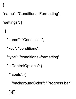
- Conditional Formatting(Structure) - Note that this is the Older Version
- index.tsx: Usually less frequently modified, but may be needed in some cases.
- If the data in Incorta is continuously changing (such as time), input {refetchInterval: [MILLISECONDS]} into the useQuery function, which is called at the top of index.tsx
- EXAMPLE: const { data, context, isLoading, isError, error } = useQuery(useContext(), prompts, {refetchInterval: 5000});
- If the data in Incorta is continuously changing (such as time), input {refetchInterval: [MILLISECONDS]} into the useQuery function, which is called at the top of index.tsx
- styles.less: Modify for more modular design and color structuring.
- Run the Component
- Start the component using:
npm start or create-incorta-component start - This will load the component and automatically connect it to your dashboard
- Start the component using:
- Dashboard Setup
- Ensure the insight added to your dashboard is named "Developer Tool"
- Each tray, in definition.json has a number which represents the minimum number of items that can be in the tray. If the number of items is less than the minimum, the component will not show.
- In order to have a minimum of 0, delete the entire minimum statement
- Live Updates:
- Save any changes you make to the component to trigger an auto-refresh in the dashboard
- To stop the component, press CTRL-C in the terminal
- Packaging
- To change the version (i.e. from 0.0.1 to 0.0.2) go to package.json and change “version.” Incorta will auto-detect that it’s the same file but a newer version.
- In order to package your component, either to test it as a proper component or to send the file to another individual to test, run the following command:
create-incorta-component package
- Then, you can input the created (.inc) file into Incorta by clicking the “Add Component” button in the Component adder widget. Then, click upload and upload the .inc file.
- To change the version (i.e. from 0.0.1 to 0.0.2) go to package.json and change “version.” Incorta will auto-detect that it is the same file but a newer version.
Once your new component is working the way you want, share it with others!
Reference Materials
Labels:


