- Incorta Community
- Knowledge
- Dashboards & Analytics Knowledgebase
- Changing Colors in your Dashboard
- Subscribe to RSS Feed
- Mark as New
- Mark as Read
- Bookmark
- Subscribe
- Printer Friendly Page
- Report Inappropriate Content
- Article History
- Subscribe to RSS Feed
- Mark as New
- Mark as Read
- Bookmark
- Subscribe
- Printer Friendly Page
- Report Inappropriate Content
on 05-06-2022 09:24 AM
Introduction
Changing the colors of dashboards and insights can add extra flair and alignment to your brand and business. This article will explore how you can change colors on your dashboard and insights.
What you need to know before reading this article
Some of the different coloration options have been released incrementally. As a result, we will call out the availability of the settings below based on the version number.
Let's Go
Before you Start
It can be easy to become very excited about creating on-brand or highly polished schemes, but before you begin the journey of changing visuals, ask yourself about your audience and the accommodations required.
Did you know that 8% of men are colorblind, and 0.5% of women are colorblind? Ensure any colorization is practical over pretty. A great example is the colors red and green together. A 'traffic light' red-yellow-green scheme may make sense for many. However, the most common color-blindness type, Deuteranopia, has trouble differentiating reds, greens, and yellows.
If you are building a color palette from scratch to be accomodating, consider reviewing WCAG standards and leveraging tools like this contrast checker or this color palette checker.
Color Palette Behavior
Before changing the palette anywhere, it's essential to know that the ordering of colors provided to Incorta will be important.
The ordering of colors from left to right is essential to the behavior of colorization. Starting from the left, the first color will be assigned first, the second color to a second, etc... For example, let's say we are creating a bar chart that groups our product revenue based on sales of each US state. By grouping on state, we would expect the alphabetically first state, 'Arizona' to inherit blue, 'Alaska' to inherit 'burnt orange,' 'California' to get 'Green-gray.'
Level 1 - Changing the Color Palette at the Platform-Level
Availability: Incorta 4.x+ and Cloud 2021.x+
A color palette can be defined for the entire platform. A color palette can be specified by going to the Cluster Management Console (CMC):
1) Select Clusters in the navigation bar
2) Select the cluster to configure
3) Select the sub-tab Cluster Configurations
4) Select the sub-sub-tab Server Configurations
5) Select UI Customizations
6) Select the desired color palette.
7) If you want to add a new custom palette, provide a comma-separated list of HEX color values.
Note: On-premises customers can configure this. For Incorta Cloud customers, send a request to Incorta Support to submit the changes on your behalf.
Any dashboards and insights using the default palette will update to using the new color palette. Additionally, new dashboards developed in the future will utilize this color palette as a base option. Finally, dashboard developers may opt to use a different palette or customize the palette to their own needs as described below.
Benefits of changing the platform color palette
- An Incredibly beneficial option to ensure all dashboards in all tenants have a consistent baseline.
- Can update the coloration of all visuals on the fly if additional color palettes at the dashboard/insight levels have not been specified.
Drawbacks of changing the platform color palette
- The new palette may not work for all visualizations developed to date if you have a wealth of pre-existing content. As a result, dashboard developers may need to refine their dashboard palettes manually.
Level 2 - Changing the Color Palette at the Dashboard Level
Availability: Incorta 4.x+ and Cloud 2021.x+
A color palette defined at the dashboard level can globally determines the colors for all insights within a dashboard. Using this feature will override the default palette provided by the platform.
To find this color palette:
- Go to the top right of your dashboard
- Select '...'
- Select Configure Settings
- Activate the Customize Color Palette selection
Once selected, you'll have the ability to select from a collection of preset palettes or define your own with Custom.
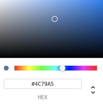
To change the colors, select any of the colors (color circle) and adjust the color selector:
Note: You can enter a custom HEX value or use the up/down toggle on the right to enter RGB or HSL values.
Benefits of changing the dashboard color palette
- Quickly configure a color theme for all visualizations within the dashboard
- If you choose to change the color palette again, all visualizations in that dashboard will update to the new color palette.
- This will 'future-proof' your dashboard from platform color palette changes.
Drawbacks of changing the dashboard color palette
- This palette is defined on a dashboard level but not a platform level. Therefore, by committing to using a custom palette over a predefined palette, you'll need to re-enter values on a dashboard by dashboard basis.
Level 3 - Changing the Insight Color - Monochromatic
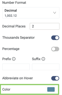
The next level below the dashboard is to change an insight's color to a single color. By doing color customization at an insight level, you are choosing to override the global platform and dashboard palette settings. To select one flat color for an insight, select the measure pill of the insight and under the format tray is an option to choose a color.
Level 4a - Changing color based on the dimension
Availability: Incorta 4.x+, Incorta Cloud 2021.x+
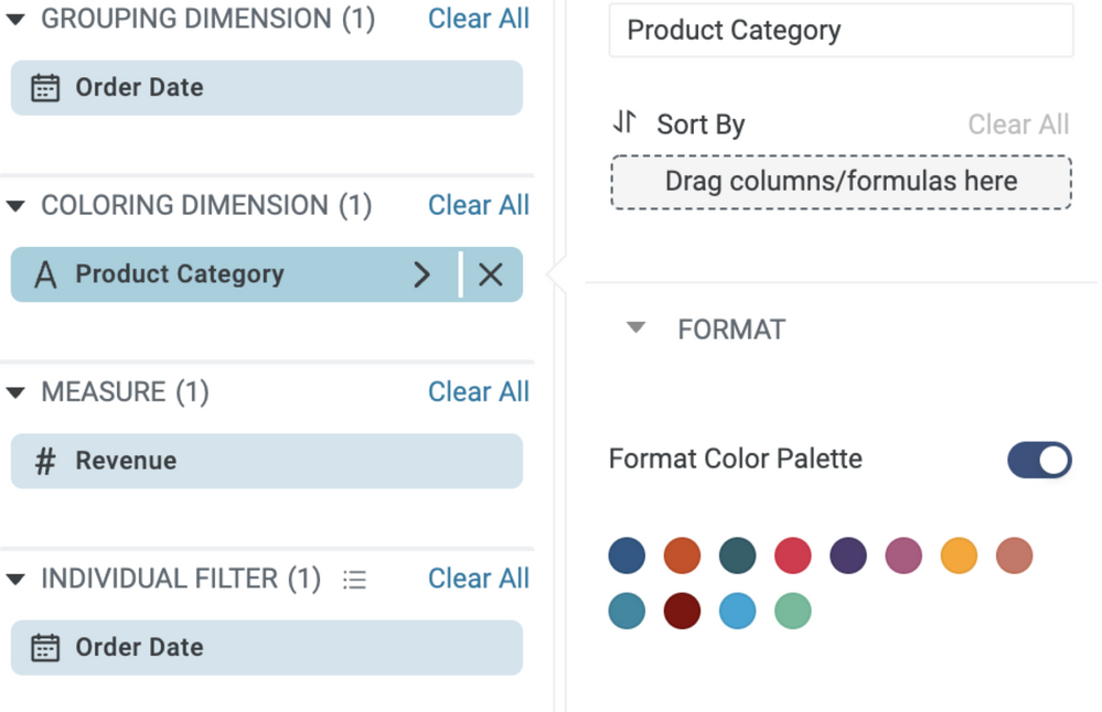
By changing the colors of the dimension, you are electing to override the palettes defined in levels 1, 2, and 3. An insight with a colorization tray must be utilized. For example, the table does not have a coloring dimension tray, but a line chart will! In many cases, using the coloring dimensions will create multiple overlays in a single insight. For example, a line chart with four unique product categories added to the color dimension tray will yield a new line chart of four lines, each with its distinct color. The color dimension can be formatted by selecting the pill and toggling on the format color palette option.
Note: Color inheritance order behavior can be changed. The color dimension pill has a sorting option. By choosing a measure to underly the coloring dimension via sort, the colors will be re-applied based on the ascending or descending order of the measure within that coloring dimension!
Level 4b - Changing color based on a measure
Availability: Incorta Cloud 2022.5+
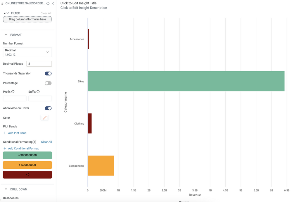
The final option available is formatting color based on a measure. Today, this operation can be done on table insights, bar charts, and column charts via conditional formatting. Additionally, this option will only be available if the coloring dimension tray is left empty.
To format the color of a dimension, select the pill in the measuring tray and select Add Conditional Format. From there, apply the logic of what conditions to use what color.
Related Material


