- Incorta Community
- Knowledge
- Dashboards & Analytics Knowledgebase
- Dashboard Design Best Practices
- Subscribe to RSS Feed
- Mark as New
- Mark as Read
- Bookmark
- Subscribe
- Printer Friendly Page
- Report Inappropriate Content
- Article History
- Subscribe to RSS Feed
- Mark as New
- Mark as Read
- Bookmark
- Subscribe
- Printer Friendly Page
- Report Inappropriate Content
03-27-2023 05:36 PM - edited 06-07-2023 08:36 AM
Introduction
If you are a developer who brings together data from multiple sources and models it for consumption or an analyst/data scientist who trolls through that data to find ad hoc insights, you will appreciate Incorta as an elegant platform that helps you deliver solutions and insights quickly. But often, the largest group of users of Incorta are read-only users who only access dashboards that have been configured specifically to help them do their jobs. This article presents principles that will help you design dashboards that will enable your typical business users to get the most out of Incorta.
What you should know before reading this article
We recommend that you be familiar with these Incorta concepts before exploring this topic further.
Applies to
These ideas apply regardless of the version of Incorta you are running.
Let’s Go
Incorta, at a very high level, is a platform that allows you to extract and load lots of data quickly in its native data model, or close to it, so that you can analyze it and take action.
Adopting Incorta
Incorta delivers powerful analytics solutions with minimal to no data engineering required, but your users do not get the benefit of this unless they use it. As with anything new, you may have to work to get your users to take advantage of Incorta. Here are a couple of things to keep in mind as you roll out Incorta solutions to your business:
- Trust - Build trust by including all of the data the business needs in Incorta and by having business users validate every Incorta use case before it is deployed to production.
- Retire Legacy Solutions - People can be creatures of habit who prefer to continue doing things the “old way” because they are comfortable with it, even when there is a new and better way. You can help them to change their ways by retiring legacy solutions that are no longer needed. As an additional benefit, you will save licensing fees for software that you are able to replace.
- Speed - Incorta is known for its speed both in terms of question to solution cycle but also in its ability to pull up insights on dashboards with all the data needed (even if that means billions of rows) in seconds or even sub-seconds. Tune Incorta so that your end users experience great performance.
- Great Content - Build dashboards that help users do their job better and faster!
Dashboard Design Makes a Difference
Well built dashboards make users efficient. Keep in mind these concepts as you design your dashboards:
- The Right Focus - A well built dashboard puts the attention on what is important to the end user
- Easy to Navigate - A well built dashboard makes it easy to dig into the details and dig out the insights that users need for their jobs
- A Call to Action - A well built dashboard makes a call to action and provides guide rails to users to make it easy for them to take the necessary actions
Concepts to Include in Content Design
The following concepts should help you with building dashboards that resonate with your end users and help them perform their jobs more effectively.
Report on What is Important to your Stakeholders
It is important to understand who your stakeholders are and what their needs are as you begin working on building out new Incorta content. The stakeholders in any line of business make strategic plans and have measures associated with them. These Key Performance Indicators (KPI) are metrics that should be reported on in Incorta. Effectively, you need to show your stakeholders what is important to them, but the KPI’s are not the end of it. You should report on all the metrics that the business uses to run their business. In addition to that, you want to provide transactional detail so that users can find all the information they need for their analyses.
KPI’s
Most organizations define 3-5 company goals on an annual basis. Each goal should have a KPI associated with it. The current values of these KPI’s should be front and center for everyone who is concerned with achieving the goals (i.e. everyone!).
You will need to understand how the KPI’s are calculated. Most KPI’s have several metrics associated with them. In most cases, if not all, KPI’s are calculated from other metrics. Here is an example breakdown of a KPI (Profits):
Identify the KPI’s used by your organization at the top level for inclusion in Incorta. In addition, every department in an organization typically has its own metrics or KPI’s that it tracks and each grouping of them should probably have a dashboard of its own that features the relevant metrics.
If you can build a hierarchy of the metrics used in a given use case, along the lines of the above example, you will end up with a map of sorts that will help you plan which dashboards you should build to support the use case with one or more dashboards corresponding to each level in the hierarchy and likely relationships/navigation paths between them.
Start at a Summary Level and Move to Detail
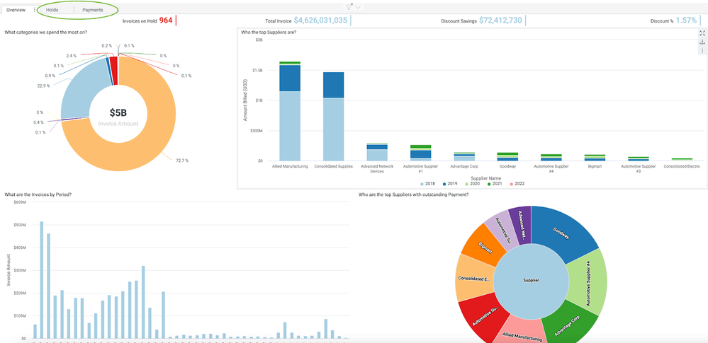
Build your dashboards around KPI’s or other key metrics. Use the Incorta KPI chart type to represent the KPI’s and place the KPI’s right at the top of the dashboard so they are the first thing that visitors see. Add drill through’s on the KPI’s to related dashboards (or tabs) so it easy for users to get into the details specific to each one.
It is also helpful to add a clear definition of each KPI/metric in the corresponding insight description and instructions on the navigation path for how to investigate further. You want the navigation path to be very clear to users so that they can be efficient with their time - they will really appreciate it! Another option is to use a separate rich text chart type to provide always visible instruction.
Place supporting insights below the KPI’s. Use these to provide the viewer insights related to the featured metrics. Two or three additional rows of visualizations suited to the information you are portraying is enough. Too many insights on one tab can result in slower rendering. Instead, put differentiated details related to the KPI’s on separate tabs of the dashboard. You can provide full transactional detail at the bottom of the first tab or on the secondary tabs depending on what makes the most sense.
Intuitive Navigation
Take advantage of all the features Incorta offers to help the users get to the answers they seek quickly. In addition to adding drill throughs on the KPI’s/metrics, you can also add them to the other insights you create to make it easy for users to get to related content.
Filters help users get to the exact data they seek quickly:
| Feature | Benefit |
| Prompts | By default, Incorta allows filtering on all displayed fields on a dashboard. A curated list of Prompts can make it easier for users to choose the appropriate filtering strategy. |
| Runtime Security Filters | Runtime Security Filters allow users to see only the data they are entitled to see. They narrow the focus for the user. |
| Applied Filters | Applied Filters, when appropriate, keep unneeded data off of insights and can help dashboard performance. |
Once a user has filtered down to the relevant transaction(s), help them take action! Add a dynamic URL to the appropriate column on your detail record to allow them to drill back to their source system to the exact transaction they need to review or update.
Setup
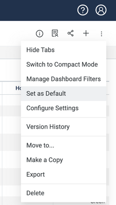
Once you have built out dashboards that make life easier for your users, it is very helpful to have them start out in the right place so that they get the benefit of what you have designed. You can do this by pre-assigning the appropriate dashboard as the default landing page for each user.
Depending on the department and the job, different users will have different dashboards that make sense for them as a daily starting place. Determine a starting dashboard for each department and/or job title, document this for user administrators, and define a process so that user admins have an easy time setting up new users with the appropriate landing page.
Teach new Incorta users how to set up bookmarks for themselves. This will help them quickly get to their preferred filtering. Data Analyzers should learn how to personalize dashboards to their needs. The Incorta for the Dashboard Consumer course is a great free resource for your users to master the basics of the Incorta UI.
Make it Fast
Incorta is known for delivering unimaginably fast analytics solutions, so tune your dashboards and your refreshes to make sure that your end users experience that. Peruse the Dashboard Design for Performance article for dashboard specific tips and tricks. In addition to dashboard specific best practices, check out the many Design for Performance articles available on the Community to help your Incorta implementation stay in tip top shape.
Final thougts
These concepts apply even if you are using Incorta to accelerate other visualization tools, like PowerBI or Tableau. You also may need to pilot these concepts with a few dashboards and then spend some time to educate your users on how to use them before you get full buy in. The data apps (available from the Marketplace) provide a good example of using this model to present data in an engaging way and are good for show and tell even if your organization does not use them otherwise.


