- Incorta Community
- Knowledge
- Dashboards & Analytics Knowledgebase
- Dashboard Shapes, Icons, and Customization
- Subscribe to RSS Feed
- Mark as New
- Mark as Read
- Bookmark
- Subscribe
- Printer Friendly Page
- Report Inappropriate Content
- Article History
- Subscribe to RSS Feed
- Mark as New
- Mark as Read
- Bookmark
- Subscribe
- Printer Friendly Page
- Report Inappropriate Content
on 03-12-2024 05:51 AM
Introduction
With the release of Incorta v2024.1, shapes have been introduced as a dashboarding component. While this might seem like a small capability, the implementation of this can launch dashboard designs to new heights.
What you need to know before reading this article
Let's Go
Why shapes?
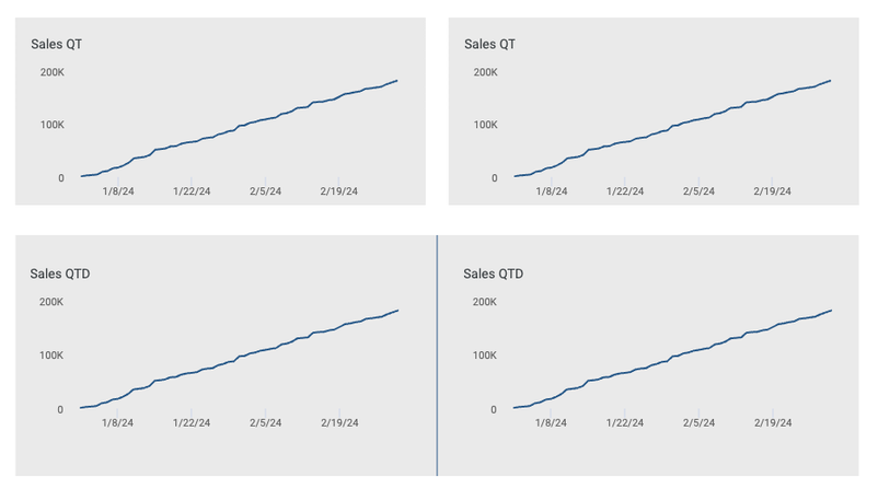
When creating insights in Incorta, we've provided robust formatting options to ensure your insight title, body, and layout are flexible. However, with the infinite need to configure outputs, shapes take formatting a step further by allowing a user to independently control the aesthetic of a dashboard without being subject to the limitations of the insight settings. Here are some basic examples:
- I have a title on my chart, but there is too much whitespace between the title and the chart. Now, you can create an insight without a title and use the text component to place it more precisely.
- I can set the background color of my insight in my dashboard, but I want to unify elements with a shared background.
What shapes can I add?
With this release, you can now create:
- Rectangles
- Circles (Oval)
- Lines
- Arrows
- Icons
- Text
Preparing Insight for Union with a Shape
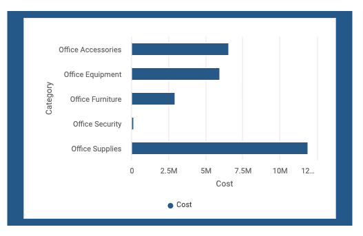
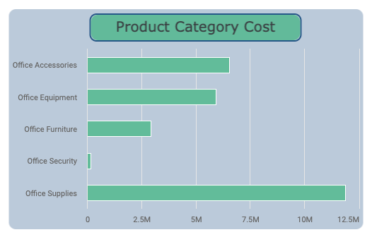
Many times, insights will be a foreground to a shape. If this is the case, make sure you format it accordingly. For Incorta, the default insight background is white. If you intend to use a shape as a background, update the background and borders to 'transparent.'
Grouping Layers is Your Friend
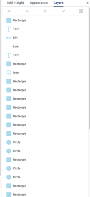
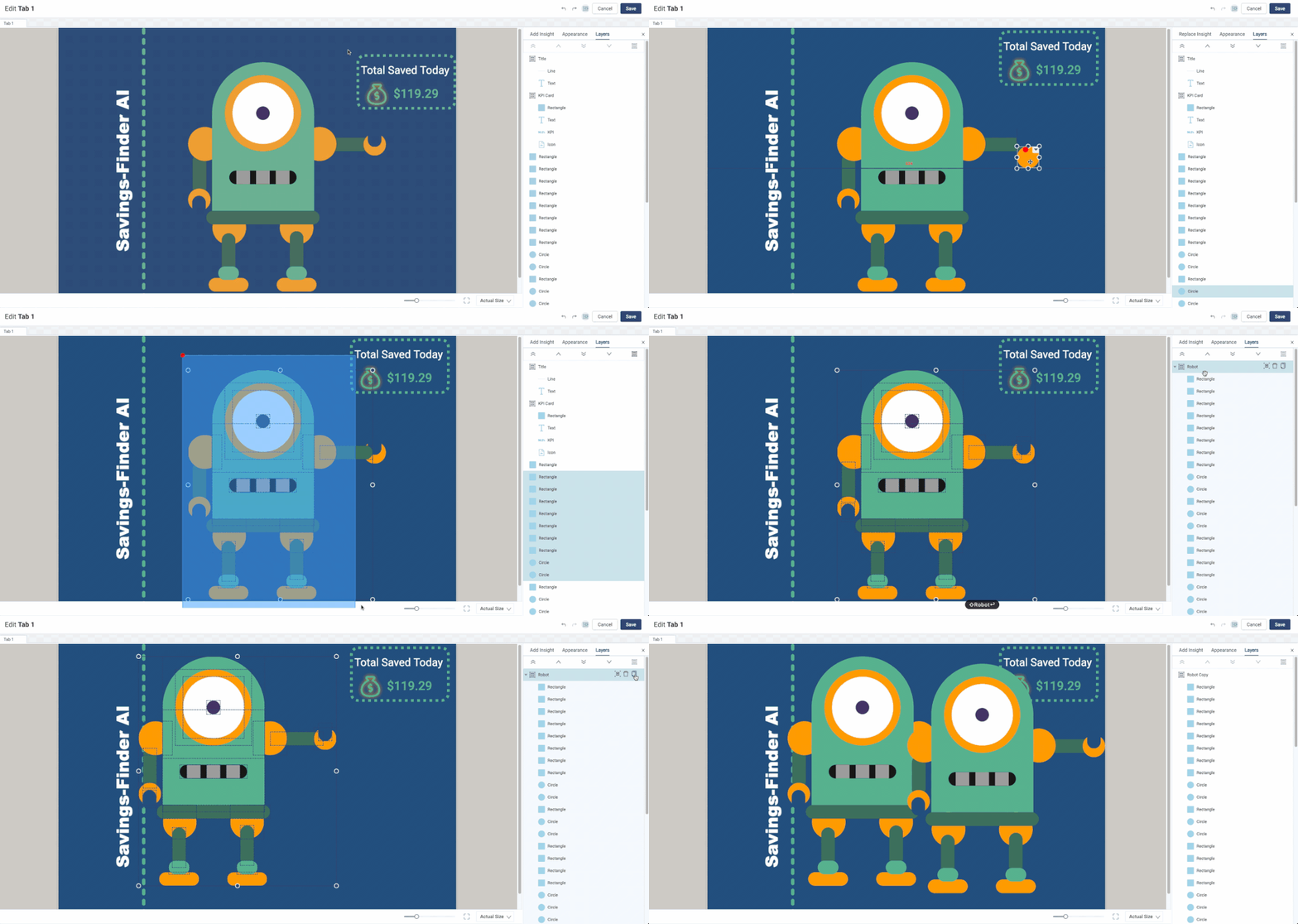
As shapes are introduced into your dashboard, the layers panel will undoubtedly become congested with objects. Also added in 2024.1 is layer grouping to better manage layers! Using grouping will make it easier to manage multiple objects in the canvas as a single object. Additionally, groups can be copied, making creating objects with shared formatting easier.
Before
Creating Groups
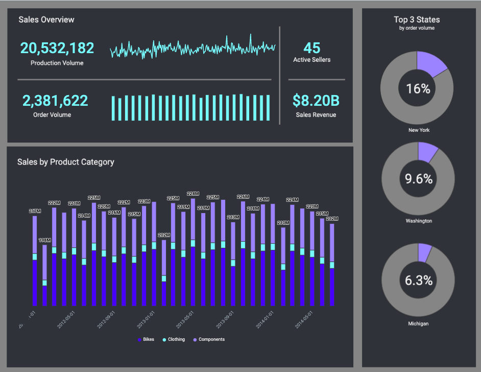
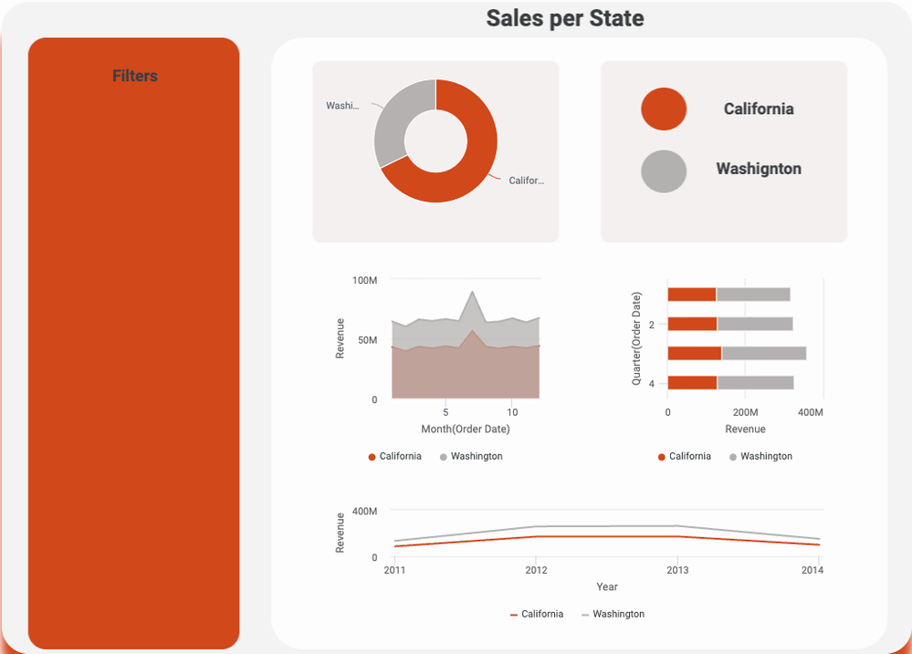
Examples to Inspire
