- Incorta Community
- Knowledge
- Dashboards & Analytics Knowledgebase
- Using the NEW Dashboard Free Form Layout
- Subscribe to RSS Feed
- Mark as New
- Mark as Read
- Bookmark
- Subscribe
- Printer Friendly Page
- Report Inappropriate Content
- Article History
- Subscribe to RSS Feed
- Mark as New
- Mark as Read
- Bookmark
- Subscribe
- Printer Friendly Page
- Report Inappropriate Content
on
05-24-2023
09:56 AM
- edited on
05-24-2023
10:49 AM
by
![]() Tristan
Tristan
Introduction
Until version 2023.4, Incorta has performed dashboarding by allowing users to add insights individually into a grid format. With the release of 2023.4, Incorta brings a new experience in building dashboards: the free form layout. By building this experience, you can now:
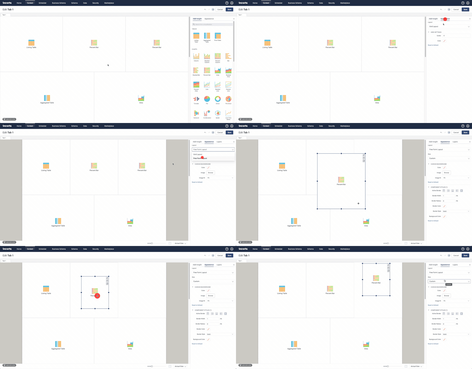
- Toggle between grid and free-form layout options
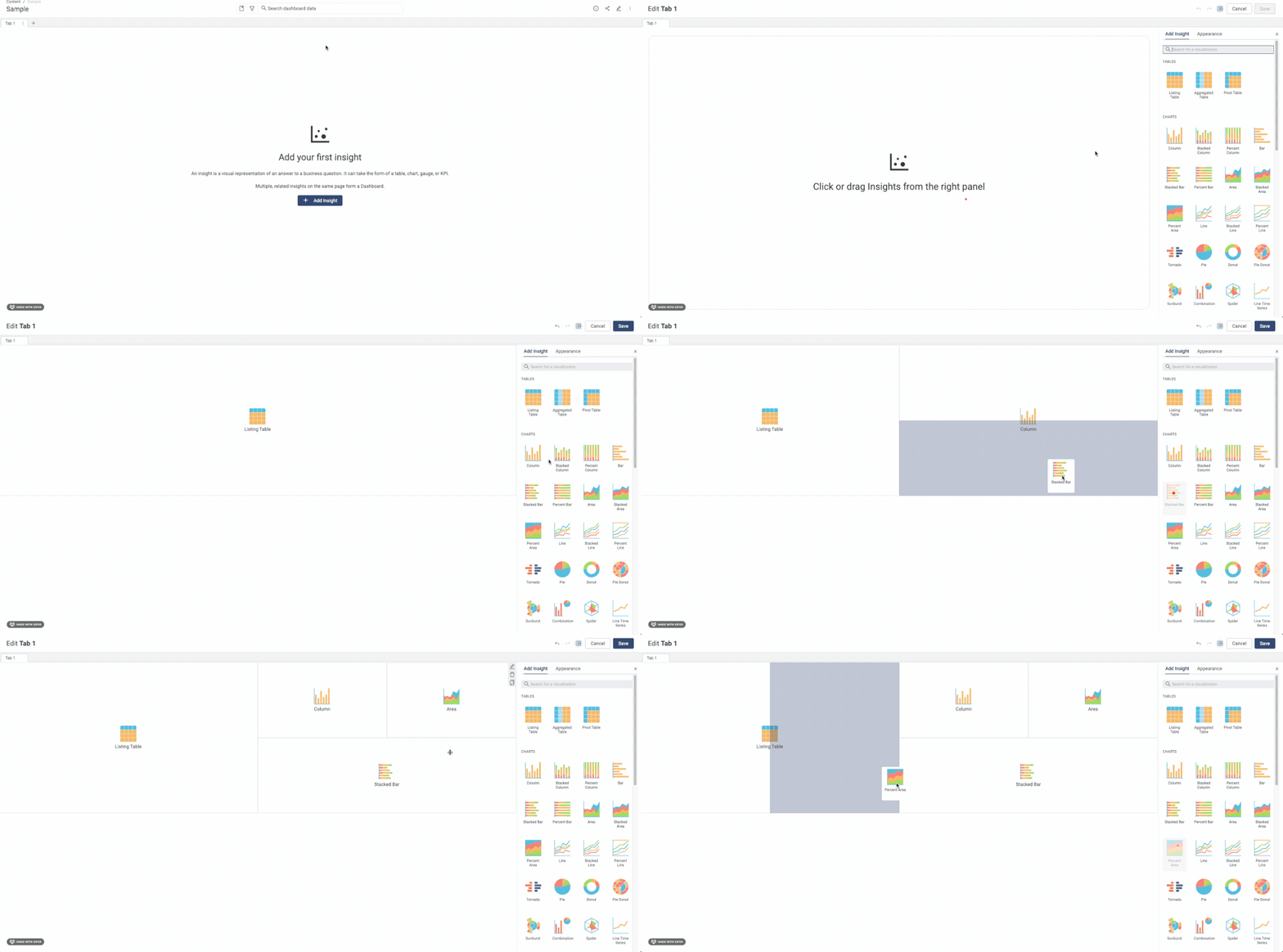
- Rapidly develop dashboard layouts by dragging and dropping insights into the canvas
- Scale and optimize report dimensions
- Further polish dashboards through enhanced customization options
Let's Go
Rapid Prototyping & Building
Before this release, each time an insight was added, it needed to be configured and placed into the canvas. This worked well from a bottom-up approach, but we know many users who want highly professional dashboards; they'll start with a wireframe of the layout and work to refine insights. This is even more so when reports are designed to be high-traffic executive reports.
Free form Layout
Yes, it's exactly what it sounds like! You can depart from the old way of laying out insights in a grid and have the control and flexibility to place and size insights wherever needed on the canvas!
Dashboard Background and Sizing
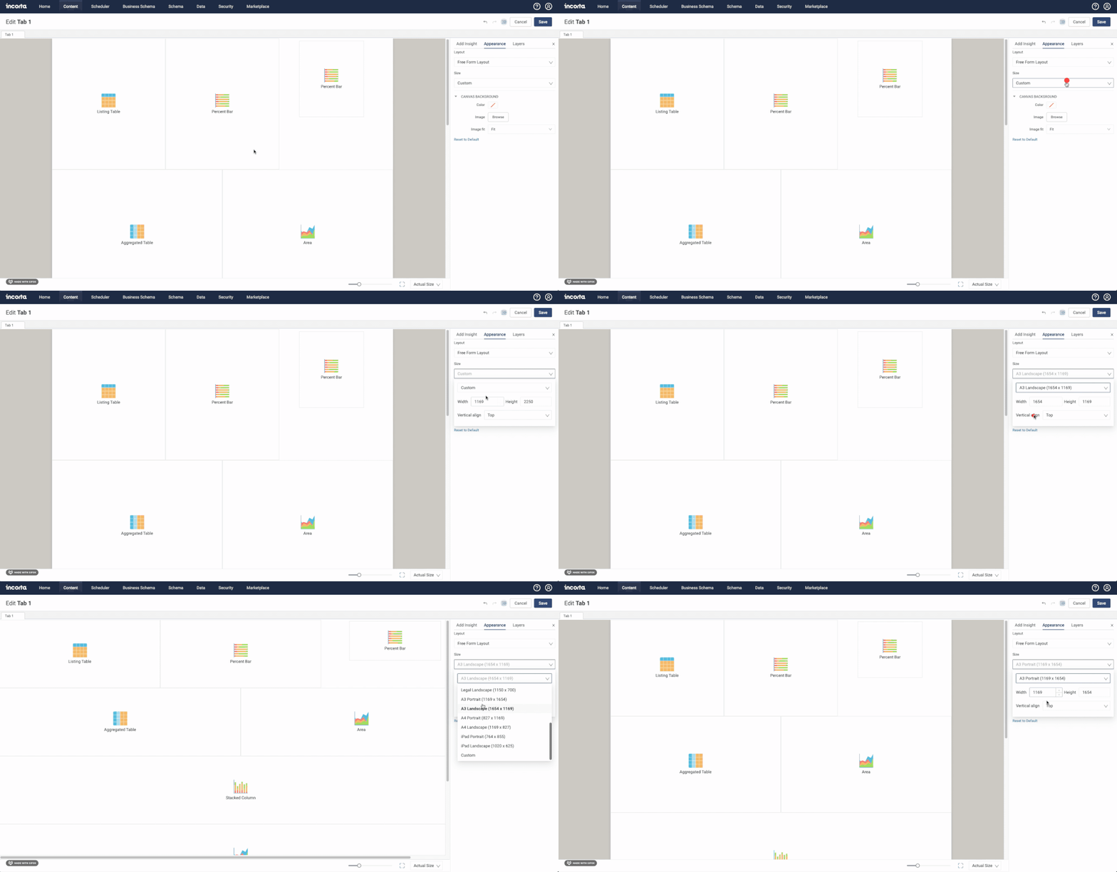
Optimize the layout of your dashboard by selecting the expected consumption sizing. Never fear! One of the critical parts of adding this feature was ensuring that the dashboard would still scale well on different OS, browsers, and devices.
Copying Insights
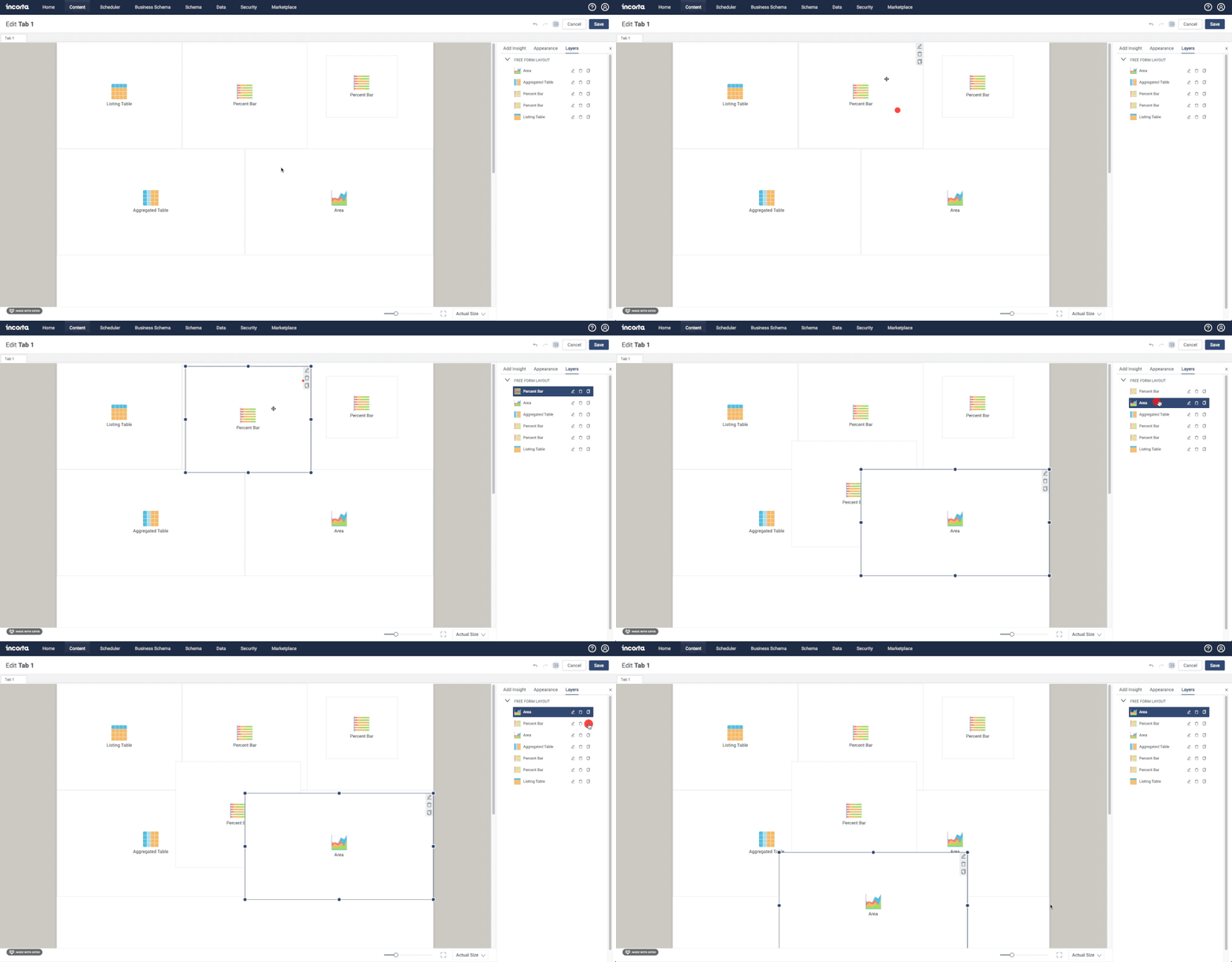
Additionally, we've streamlined the copy/paste capabilities in Incorta. Instead of copying and 'adding' an insight to paste it in, you can click the copy icon on the insight or the layers view.
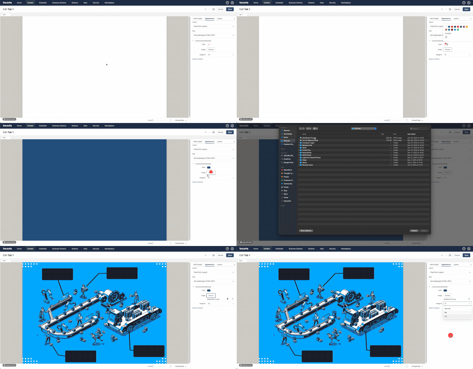
Adding Background Images or Colors
For those seeking other unique ways of enhancing dashboards, note that the free form also allows the use of a canvas background color or adding an image. This can be an excellent way of adding further context and branding to your insight.
Best Practices
Insight Backgrounds
Before setting out on your dashboard, you'll likely want to decide on a dashboard design. However, background colors can be set on the dashboard, on insights, and even influenced by the 'dark mode' of Incorta.
The single most important thing to understand is the difference between the first two color selections in the Insight background colors:
The first option is to use the system's default color. For many, it will be white, and for others, a dark gray. The dark mode toggle will dictate this. Additionally, the insight will switch colors depending on whether the dark mode is selected.
A best practice would be to agree with other developers on what to use and when. For example, if some developers select the 'no color' option while others are hard-coding the background to white, end users can have a discrepancy in experience.
The second option is transparency. No background will be applied at the insight, allowing the dashboard's background to show through.
Layers Matter
As you become more comfortable with the free-form layout, you'll likely find yourself stretching your creative boundaries by overlapping insights on each other to achieve a specific look. For example, you might use a rich text tool to act as a title with less padding than the default one on an insight. While this is entirely valid, note that you may impact report behavior despite the transparency. For example, if a transparent rich text overlaps a map with a tooltip, it will not activate in the report view because the rich text is 'blocking' it. To remedy this, either resize the individual insights or reorder the layers so the interactive elements are on top.
Inspiration
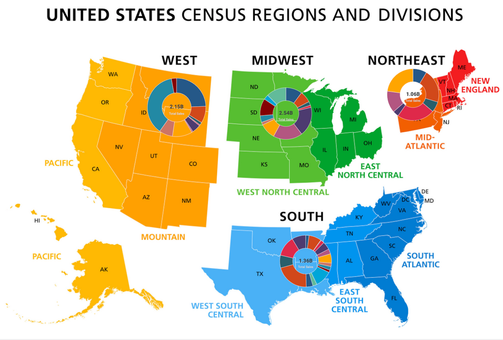
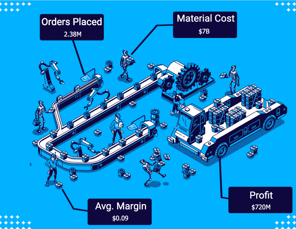
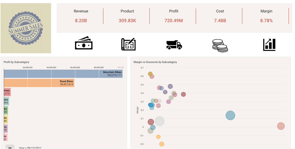
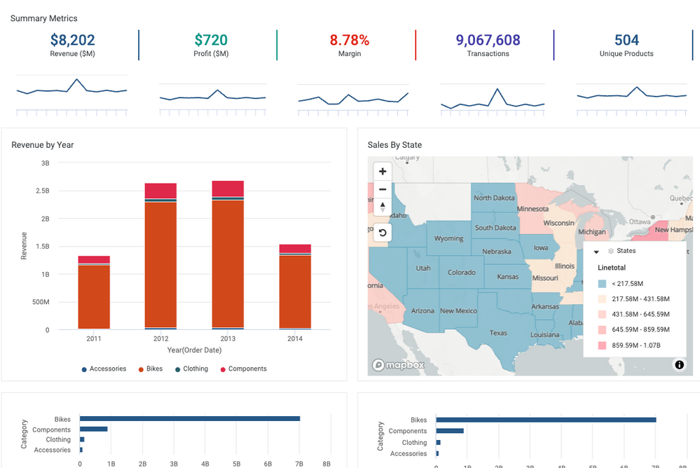
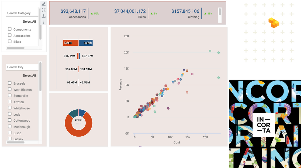
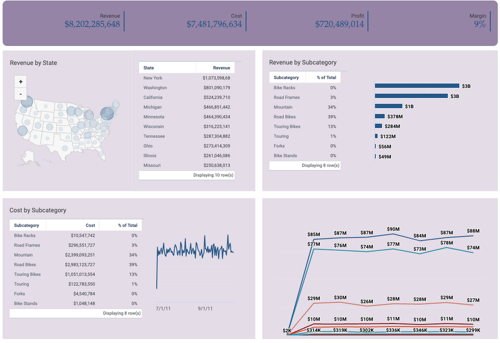
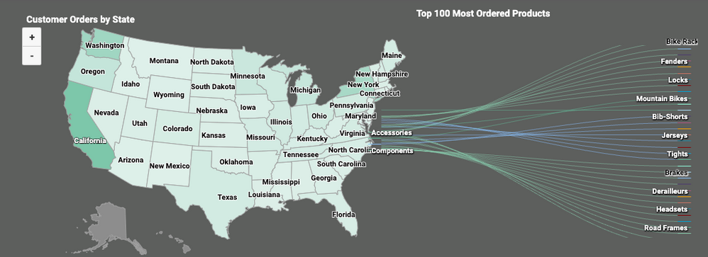
With this capability, the sky is the limit to your creativity! Here are a few fun dashboards Incorta employees have made on the Online Store data that comes with our product.
